カテゴリー:
レイアウト
閲覧数:598 配信日:2014-08-02 08:37
shape
背景形状(shape)定義
・shapeタグを使用することにより、グラデーションや枠線、角丸などの効果を持った背景形状を定義可能
・定義した形状は、backgroundで指定して使用
アイコン
・Android側では、すぐ使用できるよう、予めシステムリソースアイコンを用意している
・SDK 内の Drawable リソースが一覧できる「Android Drawables」が便利!
・R.drawable
特徴
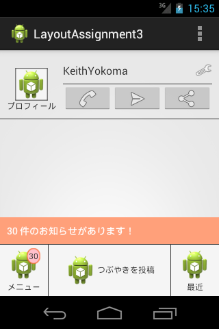
・Footer左領域と右領域のwidthは70pxで固定だが、Footer真ん中領域は異なる。具体的には"wrap_content"
構成概要
RelativeLayout … 大枠
┃
┣RelativeLayout … 一番上左のプロフィール領域
┣View … 「一番上左のプロフィール領域」右にある縦空きスペース
┣RelativeLayout … 一番上の右半分以上を占めるメイン領域
構成
・1つのRelativeLayoutの中に、複数の「RelativeLayout、View、LinearLayout」を配置
RelativeLayout
┃
┣RelativeLayout … 一番上左のプロフィール領域
┃│├android:id="@+id/ProfileImageContainer"
┃│├android:layout_alignParentLeft="true" … trueの場合、このビューの左端は、親の左端に一致
┃│└android:layout_alignParentTop="true" … trueの場合、このビューの上端は、親の上端に一致
┃│
┃├FrameLayout
┃││├android:id="@+id/ProfileImageFrame"
┃││├android:layout_centerInParent="true" … trueの場合、水平方向および垂直方向の位置が親のビューの中央になるように配置
┃││└android:background="@drawable/frame"
┃││
┃│└ImageView
┃│ ├ android:id="@+id/ProfileImageView"
┃│ ├android:layout_gravity="center" … 上下左右中央にオブジェクトを配置。サイズは変更しない
┃│ └android:src="@drawable/ic_launcher" … プロフィール画像ファイル(ic_launcher.png)
┃│
┃└TextView
┃ ├android:id="@+id/ProfileImageLabel"
┃ ├android:layout_below="@+id/ProfileImageFrame"
┃ ├android:layout_centerHorizontal="true" … 水平方向の位置が親のビューの中央になるように配置
┃ ├android:layout_marginTop="25dp"
┃ └android:text="プロフィール"
┃
┣View … 「一番上左のプロフィール領域」右にある縦空きスペース
┃ ├android:id="@+id/ProfileHeaderSpacer"
┃ ├android:layout_width="10dp"
┃ ├android:layout_height="wrap_content"
┃ ├android:layout_toRightOf="@+id/ProfileImageContainer" … 指定したビュー(プロフィール画像)の右に配置
┃ └android:layout_alignBottom="@+id/ProfileImageContainer" … ビュー下辺が「指定ビュー(プロフィール画像)」の下辺に揃うように配置
┃
┣RelativeLayout … 一番上の右半分以上を占めるメイン領域
┃│├android:layout_toRightOf="@+id/ProfileHeaderSpacer" … 指定したビューの右に配置
┃│├android:layout_alignParentTop="true" … trueの場合、このビューの上端は、親の上端に一致
┃│├android:layout_alignParentRight="true" … trueの場合、このビューの右端は、親の右端に一致
┃│├android:layout_alignBottom="@+id/ProfileImageContainer" … ビュー下辺が「指定ビュー(プロフィール画像)」の下辺に揃うように配置
┃│├android:layout_marginRight="10dp"
┃│├android:paddingTop="10dp"
┃│└android:paddingBottom="10dp"
┃│
┃├View「一番上の右半分以上を占めるメイン領域」の上部分と下部分を区別する水平線領域
┃│├android:id="@+id/ProfileViewDivider"
┃│├android:layout_width="match_parent"
┃│├android:layout_height="1dp"
┃│├android:layout_centerVertical="true" … 垂直方向の位置が親のビューの中央になるように配置
┃│└android:background="#393939"
┃│
┃├RelativeLayout … 「一番上の右半分以上を占めるメイン領域」の上部分領域
┃││├android:layout_width="match_parent"
┃││├android:layout_height="wrap_content"
┃││├android:layout_above="@+id/ProfileViewDivider" … 指定したビューの上に配置
┃││├android:layout_alignParentTop="true" … trueの場合、このビューの上端は、親の上端と一致
┃││└android:layout_alignBottom="@+id/ProfileViewDivider"
┃││
┃│├TextView
┃││├android:id="@+id/ProfileNickName"
┃││├android:layout_width="match_parent"
┃││├android:layout_height="wrap_content"
┃││├android:layout_centerVertical="true" … 垂直方向の位置が親のビューの中央になるように配置
┃││├android:layout_alignRight="@+id/SettingIcon"
┃││└android:text="KeithYokoma"
┃││
┃│└ImageView
┃│ ├android:id="@+id/SettingIcon"
┃│ ├android:layout_width="25dp"
┃│ ├android:layout_height="25dp"
┃│ │android:layout_alignParentRight="true" … trueの場合、このビューの右端は、親の右端に一致
┃│ ├android:layout_centerVertical="true" … 垂直方向の位置が親のビューの中央になるように配置
┃│ └android:src="@android:drawable/ic_menu_preferences"
┃│
┃└LinearLayout … 「一番上の右半分以上を占めるメイン領域」の下部分領域
┃ │├ android:layout_width="match_parent"
┃ │├android:layout_height="wrap_content"
┃ │├android:layout_below="@+id/ProfileViewDivider"
┃ │└android:layout_alignParentBottom="true" … trueの場合、このビューの下端は、親の下端と一致
┃ │
┃ ├ImageButton
┃ │├android:layout_width="0dp"
┃ │├android:layout_height="wrap_content"
┃ │├ android:layout_weight="1"
┃ │└android:src="@android:drawable/ic_menu_call" … システムリソースアイコン
┃ │
┃ ├ImageButton
┃ │├android:layout_width="0dp"
┃ │├android:layout_height="wrap_content"
┃ │├android:layout_weight="1"
┃ │└android:src="@android:drawable/ic_menu_send" … システムリソースアイコン
┃ │
┃ └ImageButton
┃ ├android:layout_width="0dp"
┃ ├android:layout_height="wrap_content"
┃ ├android:layout_weight="1"
┃ └android:src="@android:drawable/ic_menu_share" … システムリソースアイコン
┃
┣View … 「一番上領域」下にある水平線
┃├android:layout_width="match_parent"
┃├android:layout_height="1dp"
┃├android:layout_below="@+id/ProfileImageContainer" … ビュー下辺が「指定ビュー(プロフィール画像)」の下辺に揃うように配置
┃└android:background="#393939"
┃
┣FrameLayout
┃│├android:layout_width="match_parent"
┃│├android:layout_height="wrap_content"
┃│├android:layout_above= "@+id/FooterAreaDivider" … 指定したビュー(Footer上との境界線)の上に配置
┃│├android:padding="10dp"
┃│├android:clickable="true"
┃│└android:background="@drawable/notify_button_state_list" … notify_button_state_list.xmlで「押された状態」と「通常状態」の四角形の色を変更
┃│
┃└TextView
┃ ├android:layout_width="wrap_content"
┃ ├android:layout_height="wrap_content"
┃ ├android:text="30 件のお知らせがあります!"
┃ ├android:textColor="#FFFFFF"
┃ └android:textSize="14sp"
┃
┣View … Footer上との境界線
┃├android:id= "@+id/FooterAreaDivider"
┃├android:layout_width="match_parent"
┃├android:layout_height="1dp"
┃├android:background="#393939"
┃└android:layout_above="@+id/FooterIconContainer" … 指定したビュー(Footer左領域)の上に配置
┃
┣RelativeLayout … Footer(左領域)
┃│├android:id="@+id/FooterIconContainer"
┃│├android:layout_width="70dp"
┃│├android:layout_height="wrap_content"
┃│├android:layout_alignParentBottom="true" … trueの場合、このビューの下端は、親の下端と一致
┃│├android:layout_alignParentLeft="true"
┃│├android:padding="5dp"
┃│├android:background="@drawable/button_state_list" … button_state_list.xmlで「押された状態」と「通常状態」の四角形の色を変更
┃│└android:clickable="true"
┃│
┃├TextView … Footer一番左のテキスト(メニュー)
┃│├android:id="@+id/FooterIcon"
┃│├android:layout_width="wrap_content"
┃│├android:layout_height="wrap_content"
┃│├android:layout_centerHorizontal="true"
┃│├android:layout_below="@+id/FooterIcon"
┃│├android:gravity="center"
┃│├android:drawableTop="@drawable/ic_launcher"
┃│├android:text="メニュー"
┃│└android:textSize="12sp"
┃│
┃└TextView
┃ ├android:id="@+id/FooterIconBadge"
┃ ├android:layout_width="wrap_content"
┃ ├android:layout_height="wrap_content"
┃ ├android:layout_alignTop="@+id/FooterIcon" … このビューの上端が、指定したビュー(メニュー)の上端と一致するように配置
┃ ├android:layout_alignRight="@+id/FooterIcon" … このビューの右端を、指定したビュー(メニュー)の右端と一致するように配置
┃ ├android:gravity="center"
┃ ├android:text="30"
┃ ├android:textSize="12sp"
┃ └android:background="@drawable/badge"
┃
┣View … Footer左の縦境界線
┃ ├android:id="@+id/FirstDivider"
┃ ├android:layout_width="1dp"
┃ ├android:layout_height="wrap_content"
┃ ├android:layout_alignTop= "@+id/FooterIconContainer" … このビューの上端が、指定したビュー(Footer左領域)の上端と一致するように配置
┃ ├android:layout_alignBottom="@+id/FooterIconContainer" … ビューの下辺が指定したビュー(Footer左領域)の下辺に揃うように配置
┃ ├android:layout_toRightOf="@+id/FooterIconContainer" … 指定したビュー(Footer左領域)の右に隣接配置。重ねない
┃ └android:background="#393939"
┃
┣RelativeLayout … Footer(右領域)
┃│├android:id= "@+id/FooterRecentContainer"
┃│├android:layout_width="70dp"
┃│├android:layout_height="wrap_content"
┃│├android:layout_alignTop="@+id/FooterIconContainer" … このビューの上端が、指定したビュー(Footer左領域)の上端と一致するように配置
┃│├android:layout_alignBottom="@+id/FooterIconContainer" … ビューの下辺が指定したビュー(Footer左領域)の下辺に揃うように配置
┃│├android:layout_alignParentBottom="true" … trueの場合、このビューの下端は、親の下端と一致
┃│├android:layout_alignParentRight="true"
┃│├android:padding="5dp"
┃│├android:background="@drawable/button_state_list" … button_state_list.xmlで「押された状態」と「通常状態」の四角形の色を変更
┃│└android:clickable="true"
┃│
┃└TextView
┃ ├android:id="@+id/FooterRecentLabel"
┃ ├android:layout_width="wrap_content"
┃ ├android:layout_height="wrap_content"
┃ ├android:layout_centerHorizontal="true" … 水平方向の位置が親ビューの中央になるように配置
┃ ├android:layout_below="@+id/FooterRecent" … このidが何なのか不明
┃ ├android:gravity="center" … 水平方向と垂直方向の中央に配置
┃ ├android:text="最近"
┃ ├android:textSize="12sp"
┃ └android:drawableTop="@drawable/ic_launcher"
┃
┣View … Footer右の縦境界線
┃ ├android:id= "@+id/SecondDivider"
┃ ├android:layout_width="1dp"
┃ ├android:layout_height="wrap_content"
┃ ├android:layout_alignTop= "@+id/FooterRecentContainer" … このビューの上端が、指定したビュー(Footer右領域)の上端と一致するように配置
┃ ├android:layout_alignBottom= "@+id/FooterRecentContainer" … ビューの下辺が指定したビュー(Footer右領域)の下辺に揃うように配置
┃ ├android:layout_toLeftOf= "@+id/FooterRecentContainer" …指定したビュー(Footer右領域)の左に隣接して配置。重ねない
┃ └android:background="#393939"
┃
┗RelativeLayout … Footer(真ん中領域)
│├android:id="@+id/FooterPostContainer"
│├android:layout_width="wrap_content"
│├android:layout_height="wrap_content"
│├android:layout_alignTop="@+id/FooterIconContainer" … このビューの上端が、指定したビュー(Footer左領域)の上端と一致するように配置
│├android:layout_alignBottom="@+id/FooterIconContainer" … ビューの下辺が指定したビュー(Footer左領域)の下辺に揃うように配置
│├android:layout_alignLeft="@+id/FirstDivider" … 指定したView(Footer左の縦境界線)の左端と、このViewの左端を重ねる
│├android:layout_alignRight= "@+id/SecondDivider" … このビューの右端を、指定したビュー(Footer右の縦境界線)の右端と一致するように配置
│├android:layout_marginLeft="1dp"
│├android:layout_marginRight="1dp"
│├android:background="@drawable/button_state_list" … button_state_list.xmlで「押された状態」と「通常状態」の四角形の色を変更
│└android:clickable="true"
│
└TextView
├android:layout_centerInParent="true" … trueの場合、水平方向および垂直方向の位置が親のビューの中央になるように配置
├android:drawableLeft="@drawable/ic_launcher"
├android:gravity="center" … 水平方向と垂直方向の中央に配置
└android:text="つぶやきを投稿"
コード
▼/MainActivity.java
package jp.mixi.assignment.layout.adv;


import android.os.Bundle;

import android.app.Activity;

import android.view.Menu;


public class MainActivity extends Activity {


    @Override

    protected void onCreate(Bundle savedInstanceState) {

        super.onCreate(savedInstanceState);

        setContentView(R.layout.activity_main);

    }


    @Override

    public boolean onCreateOptionsMenu(Menu menu) {

        // Inflate the menu; this adds items to the action bar if it is present.

        getMenuInflater().inflate(R.menu.main, menu);

        return true;

    }


}
▼/res/layout/activity_main.xml
<RelativeLayout xmlns:android="http://schemas.android.com/apk/res/android"

    xmlns:tools="http://schemas.android.com/tools"

    android:layout_width="match_parent"

    android:layout_height="match_parent"

    tools:context=".MainActivity">

    <!-- TODO: 左側から順に、下記の View を配置していき、そのまとまりを画面上部に揃える -->

    <!-- 1. プロフィール画像(ic_launcher)と、それを囲う四角形の枠、その下に プロフィール と書かれた文字 -->

    <!-- 2. 1. の右側の上半分に、ニックネームの表示と、そのさらに右端に設定アイコン -->

    <!-- 3. 1. の右側の下半分に、電話ボタン、メール送信ボタン、共有ボタンの 3 つを均等割付 -->

    <!-- 4. 2. と 3. の間に分割線 -->

    <!-- 条件: 3. 以外では LinearLayout を使ってはならない -->

    <!-- Hint: 1. 画像の表示には、android:src="@drawable/ic_launcher" 属性を使います -->

    <!-- Hint: 2. 画像を表示しながら、ボタンとして機能させる特別なボタンの View があります -->

    <!-- Hint: 3. 区切り線を引く専用の UI はありません。背景色を android:background="#393939" にして、区切り線ぽく扱う工夫が必要です -->

    <!-- Hint: 4. 均等割付するボタンの画像は、左から android:src="@android:drawable/ic_menu_call", android:src="@android:drawable/ic_menu_send", android:src="@android:drawable/ic_menu_share" です -->

    <!-- TODO: 上記のまとまりの下に、幅 1 dp の区切り線を引く -->

    <RelativeLayout

        android:id="@+id/ProfileImageContainer"

        android:layout_width="wrap_content"

        android:layout_height="wrap_content"

        android:layout_alignParentLeft="true"

        android:layout_alignParentTop="true"

        android:layout_marginLeft="10dp"

        android:paddingBottom="10dp">

        <FrameLayout

            android:id="@+id/ProfileImageFrame"

            android:layout_width="wrap_content"

            android:layout_height="wrap_content"

            android:layout_centerInParent="true"

            android:background="@drawable/frame">

            <ImageView

                android:id="@+id/ProfileImageView"

                android:layout_width="wrap_content"

                android:layout_height="wrap_content"

                android:layout_gravity="center"

                android:src="@drawable/ic_launcher"/>

        </FrameLayout>

        <TextView

            android:id="@+id/ProfileImageLabel"

            android:layout_width="wrap_content"

            android:layout_height="wrap_content"

            android:layout_below="@+id/ProfileImageFrame"

            android:layout_centerHorizontal="true"

            android:layout_marginTop="25dp"

            android:text="プロフィール"

            android:textSize="12sp"/>

    </RelativeLayout>

    <View

        android:id="@+id/ProfileHeaderSpacer"

        android:layout_width="10dp"

        android:layout_height="wrap_content"

        android:layout_toRightOf="@+id/ProfileImageContainer"

        android:layout_alignBottom="@+id/ProfileImageContainer"/>

    <RelativeLayout

        android:layout_width="match_parent"

        android:layout_height="wrap_content"

        android:layout_toRightOf="@+id/ProfileHeaderSpacer"

        android:layout_alignParentTop="true"

        android:layout_alignParentRight="true"

        android:layout_alignBottom="@+id/ProfileImageContainer"

        android:layout_marginRight="10dp"

        android:paddingTop="10dp"

        android:paddingBottom="10dp">

        <View

            android:id="@+id/ProfileViewDivider"

            android:layout_width="match_parent"

            android:layout_height="1dp"

            android:layout_centerVertical="true"

            android:background="#393939"/>

        <RelativeLayout

            android:layout_width="match_parent"

            android:layout_height="wrap_content"

            android:layout_above="@+id/ProfileViewDivider"

            android:layout_alignParentTop="true"

            android:layout_alignBottom="@+id/ProfileViewDivider">

            <TextView

                android:id="@+id/ProfileNickName"

                android:layout_width="match_parent"

                android:layout_height="wrap_content"

                android:layout_centerVertical="true"

                android:layout_alignRight="@+id/SettingIcon"

                android:text="KeithYokoma"

                android:textSize="16sp"/>

            <ImageView

                android:id="@+id/SettingIcon"

                android:layout_width="25dp"

                android:layout_height="25dp"

                android:layout_alignParentRight="true"

                android:layout_centerVertical="true"

                android:src="@android:drawable/ic_menu_preferences"/>

        </RelativeLayout>

        <LinearLayout

            android:layout_width="match_parent"

            android:layout_height="wrap_content"

            android:layout_below="@+id/ProfileViewDivider"

            android:layout_alignParentBottom="true">

            <ImageButton

                android:layout_width="0dp"

                android:layout_height="wrap_content"

                android:layout_weight="1"

                android:src="@android:drawable/ic_menu_call"/>

            <ImageButton

                android:layout_width="0dp"

                android:layout_height="wrap_content"

                android:layout_weight="1"

                android:src="@android:drawable/ic_menu_send"/>

            <ImageButton

                android:layout_width="0dp"

                android:layout_height="wrap_content"

                android:layout_weight="1"

                android:src="@android:drawable/ic_menu_share"/>

        </LinearLayout>

    </RelativeLayout>

    <View

        android:layout_width="match_parent"

        android:layout_height="1dp"

        android:layout_below="@+id/ProfileImageContainer"

        android:background="#393939"/>


    <!-- TODO: 左側から順に、下記の View を配置していき、そのまとまりを画面下部に揃える -->

    <!-- 1. ic_launcher のアイコンと、その下に メニュー の文字を表示し、アイコンの右肩に 30 と書かれたバッチを表示するボタン -->

    <!-- 2. 幅 1dp の 縦の区切り線 -->

    <!-- 3. ic_launcher のアイコンと、その右に つぶやきを投稿 の文字を表示しているボタン -->

    <!-- 4. 幅 1dp の 縦の区切り線 -->

    <!-- 5. ic_launcher のアイコンと、その下に 最近 の文字を表示しているボタン -->

    <!-- 条件: LinearLayout は一切使用しない -->

    <!-- Hint: 1. ボタンですが Button は使いません -->

    <!-- Hint: 2. ボタン用の背景は android:background="@drawable/button_state_list" にします -->

    <!-- Hint: 3. バッチ用の背景は android:background="@drawable/badge" にします -->

    <!-- Hint: 4. TextView には、文字の隣に drawable を表示する属性があります -->


    <!-- TODO: 上記の View の上に、お知らせを表示する View を配置する -->

    <!-- Hint: 1. お知らせを表示する View の背景は android:background="@drawable/notify_button_state_list" にします -->

    <FrameLayout

        android:layout_width="match_parent"

        android:layout_height="wrap_content"

        android:layout_above="@+id/FooterAreaDivider"

        android:padding="10dp"

        android:clickable="true"

        android:background="@drawable/notify_button_state_list">

        <TextView

            android:layout_width="wrap_content"

            android:layout_height="wrap_content"

            android:text="30 件のお知らせがあります!"

            android:textColor="#FFFFFF"

            android:textSize="14sp"/>

    </FrameLayout>

    <View

        android:id="@+id/FooterAreaDivider"

        android:layout_width="match_parent"

        android:layout_height="1dp"

        android:background="#393939"

        android:layout_above="@+id/FooterIconContainer"/>

    <RelativeLayout

        android:id="@+id/FooterIconContainer"

        android:layout_width="70dp"

        android:layout_height="wrap_content"

        android:layout_alignParentBottom="true"

        android:layout_alignParentLeft="true"

        android:padding="5dp"

        android:background="@drawable/button_state_list"

        android:clickable="true">

        <TextView

            android:id="@+id/FooterIcon"

            android:layout_width="wrap_content"

            android:layout_height="wrap_content"

            android:layout_centerHorizontal="true"

            android:layout_below="@+id/FooterIcon"

            android:gravity="center"

            android:drawableTop="@drawable/ic_launcher"

            android:text="メニュー"

            android:textSize="12sp"/>

        <TextView

            android:id="@+id/FooterIconBadge"

            android:layout_width="wrap_content"

            android:layout_height="wrap_content"

            android:layout_alignTop="@+id/FooterIcon"

            android:layout_alignRight="@+id/FooterIcon"

            android:gravity="center"

            android:text="30"

            android:textSize="12sp"

            android:background="@drawable/badge"/>

    </RelativeLayout>

    <View

        android:id="@+id/FirstDivider"

        android:layout_width="1dp"

        android:layout_height="wrap_content"

        android:layout_alignTop="@+id/FooterIconContainer"

        android:layout_alignBottom="@+id/FooterIconContainer"

        android:layout_toRightOf="@+id/FooterIconContainer"

        android:background="#393939"/>

    <RelativeLayout

        android:id="@+id/FooterRecentContainer"

        android:layout_width="70dp"

        android:layout_height="wrap_content"

        android:layout_alignTop="@+id/FooterIconContainer"

        android:layout_alignBottom="@+id/FooterIconContainer"

        android:layout_alignParentBottom="true"

        android:layout_alignParentRight="true"

        android:padding="5dp"

        android:background="@drawable/button_state_list"

        android:clickable="true">

        <TextView

            android:id="@+id/FooterRecentLabel"

            android:layout_width="wrap_content"

            android:layout_height="wrap_content"

            android:layout_centerHorizontal="true"

            android:layout_below="@+id/FooterRecent"

            android:gravity="center"

            android:text="最近"

            android:textSize="12sp"

            android:drawableTop="@drawable/ic_launcher"/>

    </RelativeLayout>

    <View

        android:id="@+id/SecondDivider"

        android:layout_width="1dp"

        android:layout_height="wrap_content"

        android:layout_alignTop="@+id/FooterRecentContainer"

        android:layout_alignBottom="@+id/FooterRecentContainer"

        android:layout_toLeftOf="@+id/FooterRecentContainer"

        android:background="#393939"/>

    <RelativeLayout

        android:id="@+id/FooterPostContainer"

        android:layout_width="wrap_content"

        android:layout_height="wrap_content"

        android:layout_alignTop="@+id/FooterIconContainer"

        android:layout_alignBottom="@+id/FooterIconContainer"

        android:layout_alignLeft="@+id/FirstDivider"

        android:layout_alignRight="@+id/SecondDivider"

        android:layout_marginLeft="1dp"

        android:layout_marginRight="1dp"

        android:background="@drawable/button_state_list"

        android:clickable="true">

        <TextView

            android:layout_width="wrap_content"

            android:layout_height="wrap_content"

            android:layout_centerInParent="true"

            android:drawableLeft="@drawable/ic_launcher"

            android:gravity="center"

            android:text="つぶやきを投稿"

            android:textSize="12sp"/>

    </RelativeLayout>

</RelativeLayout>
▼/res/drawable/button_state_list.xml
<?xml version="1.0" encoding="utf-8"?>

<selector xmlns:android="http://schemas.android.com/apk/res/android">

    <!-- View が押された状態の Drawable -->

    <item android:state_pressed="true">

        <shape android:shape="rectangle">

            <solid android:color="#696969"/>

        </shape>

    </item>

    <!-- View が通常の状態の Drawable -->

    <item>

        <shape android:shape="rectangle">

            <solid android:color="#f5f5f5"/>

        </shape>

    </item>

</selector>
▼res/drawable/frame.xml
<?xml version="1.0" encoding="utf-8"?>

<shape

    xmlns:android="http://schemas.android.com/apk/res/android"

    android:shape="rectangle" >

    <solid android:color="#f5f5f5"/>

    <stroke

        android:width="1dp"

        android:color="#000000"/>

</shape>
▼res/drawable/notify_button_state_list.xml
<?xml version="1.0" encoding="utf-8"?>

<selector xmlns:android="http://schemas.android.com/apk/res/android">

    <!-- View が押された状態の Drawable -->

    <item android:state_pressed="true">

        <shape android:shape="rectangle">

            <solid android:color="#bc8f8f"/>

        </shape>

    </item>

    <!-- View が通常の状態の Drawable -->

    <item>

        <shape android:shape="rectangle">

            <solid android:color="#ffa07a"/>

        </shape>

    </item>

</selector>